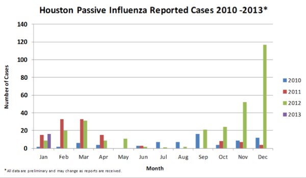
Houston health officials released a report on the flu’s (PDF) impact on the local region for the end of December, and two graphs in it jumped out at us. The first was the comparison chart with recent years, showing how more profound this year’s event has been compared to other annual flu seasons.

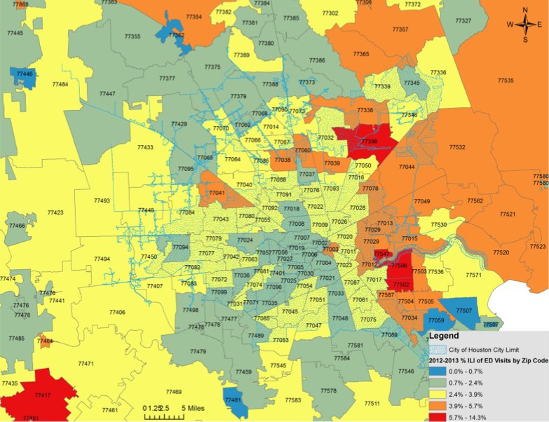
And the other was this zip-code based map that shows where the current hot-spots have been for infections.

What’s going on in two of the hottest zones on the map was the focus of a investigation by KHOU 11 News
